If someone were to hand you a sheet with raw data printed on it, how long would it be before you doze off because it was too much to absorb? Well, not much. This is where Data Visualization and Data Storytelling come into hand. These methods extract helpful information from the raw data and present them in a more understandable and visually pleasing way. Hence, you would not have to go through data irrelevant to you.
Naturally, the human mind is designed in a way that it grasps graphic content better when compared to raw text. As studies suggest:
“Human brains process visuals 60,000 times faster than they do text.”
–Source
Moreover, visual content has the edge of being able to pack much more information in considerably lesser space. For example, a table would not be as easy to read as a pictograph, right? In fact, a pictograph would be easy to read and much quicker, making visual content both faster and easier to perceive.
This article aims to answer your questions regarding data visualization and storytelling. By the end of this article, you will have a clear understanding of the following concepts.
What Is Data Visualization and Storytelling?
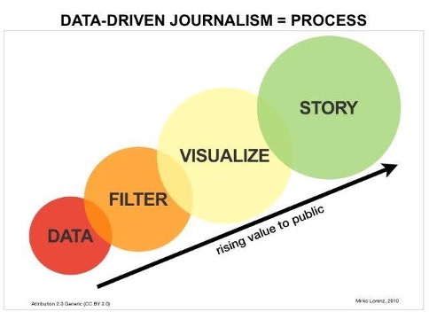
Data visualization is a field that combines both Art and Science, requiring strong designing, computing, and statistical skills. Data visualizations act as a map between the actual and the graphical version of the data. At the same time, Data Storytelling is the method of explaining what is happening in your dataset through visualizations and narratives.
Different variables are compared in various graphical forms, and their effect on each other is recorded and displayed. This increases the readability of complex data and makes it more aesthetically pleasing.
For instance, if you are looking at a point chart, each point represents a particular value from the actual data. What would you prefer, reading through a bunch of numbers or looking at a dot?
However, even looking at a point without any explanation can be enigmatic; this is where data storytelling helps us. It will explain the purpose of that particular point, therefore, making everything clear.
Additional Topics Covered
– How you can visualize your data
– What are some methods of data visualization, and which one is best for you
– What are the components of data storytelling, along with its components
– How to efficiently write a data-driven story
– Some examples of data visualization and storytelling
– Why are these two particular methods important for us
How Can You Visualize Data?
The step-wise guide to successfully represent your data graphically is:
1. Determine the purpose of your task:
The first step to solving a problem is identifying the problem and what it requires. Try thinking of this as what type of questions you will be answering through your final piece. KPIs (Key Performance Indicators) help you in this step because you need to understand what is being asked since KPIs evaluate and help you make the right choice.
2. What type of audience will you be entertaining?
There are different types of methods to approach specific age groups. It is essential to know your target audience because some people require a high-level summary of the data, whereas sometimes, you need to dumb down the information for some people.
3. What is the simplest way to represent your data?
Choosing the simplest yet most effective method of representing your information can sometimes be the most challenging decision.
The more you complicate your visuals, the more difficult it comes to making new decisions using that information.
Therefore, you must:
- Choose a simple visual that effectively represents all of your information.
- Make sure that you not only focus on the graphics but also include relevant details.
- Make sure that you do not leave out anything essential and provide context for everything to be easy to assess and interpret.
4. Make sure it’s useful:
The primary purpose of the entire task is to summarize your data so that you can use it to make new decisions in the future. Therefore, people should be able to derive conclusions using your reports without any hassle.
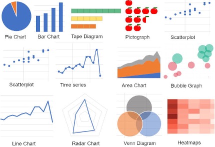
Which Data Visualization Method Is Suitable for You?
· Tables
Though tablets are a somewhat structured approach towards organizing your data, it tends to get complicated when dealing with too many variables.
· Line Charts
This type of visual is most effective when representing the rise and fall of different trends over time.
· Bar Charts
This type of chart is mainly used to compare the quantities of some (not too many) variables.
· Pie Charts
While comparing parts of a single thing, a pie chart proves most fruitful. Each part of the pie chart represents a single contributing factor.
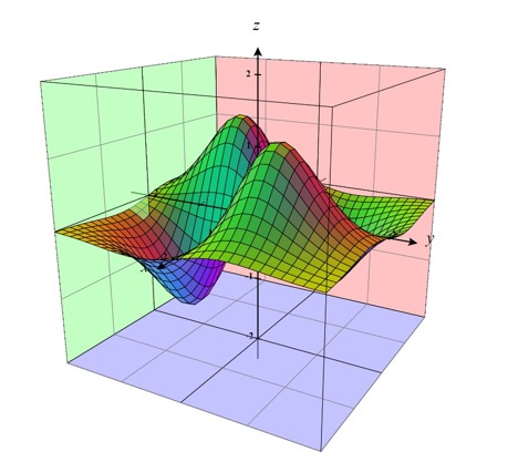
· Scatterplots
While comparing two elements, scatterplots are used. The independent and dependent variables are plotted against two axes, and the relation between them is displayed through dots representing numeric values.
What makes visualized data more valuable?
The world is evolving, and it’s getting harder to keep up with everything; that is why we need data visualization tools to help us deal with the increasing challenges.
These tools can help you by:
- Identifying how much one thing depends on the other to make better business decisions
- It shows us what was more beneficial first and predicts what could be helpful in the near future
- What is most popular amongst the customers by recording customer feedback and predicting the potential of future products
- Helps you keep up with the cut-throat competition in the market
- Keeping an eye out for opportunities for you
- Looking at insights and letting you know what your strengths are and what are your weak points
- Allows you to interact with your audience
- Stops you from repeating your old mistakes and making new mistakes
- Helps you identify patterns in your data
- Makes it easier for you to understand your data
Data Storytelling – How does it impact the human brain?
Considering how complex data is getting nowadays, the best way to understand it is by turning it into a story that is easy to digest. The storytelling process makes data easier to understand and engages the viewer psychologically by engaging multiple parts of their brain. This is because the human brain prefers stories instead of raw data since it is easier to determine what is more meaningful through a story.
As studies suggest, “High-quality infographics are 30x more likely to be read than plain text.”
You can use data storytelling:
1. From within a company:
To keep an eye on the latest trends or see which one of your products is most popular amongst your customers, make marketing reports, etc.
2. For your customers:
To make eye-catching advertising to compel your customers to buy your products and for good articles.
And you can use it for:
- Informing your entire team about what is going on in the company
- Every employee can get answers tailored explicitly instead of going through vast amounts of data.
- You can restrict your information so people can only see the data they have to see.
Components Of Data Storytelling
A data-driven story is actually a result of three different components working together.
These components are:
1. Data Science:
Data science is a field of science that focuses on extracting meaningful information from different data sets. Though the extraction may seem simple, most data scientists find it challenging to change that data into an interactive story.
2. Visualizations:
The best way to summarize your data is to convert it into different graphs and charts. These graphs and charts undoubtedly make it easier to understand the data, but without any proper context for what is happening, these visualizations may also result in confusion.
3. Data Narratives:
This component of data storytelling takes the help of language and words. It plays the most important role by giving a comprehensive overview of what is displayed in the visualizations. Proper context may enable your audience to make good use of the data you are presenting.
How To Make an Excellent Data-Driven Story?
The steps to making a good data story are similar to making a data visualization.
- What type of questions are you answering?
The most crucial step is to decide the purpose of your entire data story. This way, you will be able to keep your story to the point by providing only the relevant details.
- Summarize it as much as you can.
Stretching the story will only bore the viewer; therefore, it is vital to keep your responses short. Sometimes it is also better than the viewer sees less. Lastly, going with an appropriate speed is recommended but make sure it’s not hard to follow for the audience.
- Provide the data in order.
The content organization is key. Sometimes you do a good amount of research, but the lack of order makes it difficult to understand. It becomes easier to apprehend the entire story when you give everything a structure.
- Make an outline of the entire story.
This way, you will be making it easier for yourself because you will know what pattern you will be following and what you will be talking about. You need to maintain the connection between all data points.
- Emphasize the important Stuff.
You need to make sure that the audience knows the most crucial part of your story, and you can do that by emphasizing them.
- Restate your main ideas.
Towards the end, the main idea usually gets lost; that is why it is better to restate your main argument again in the end.
- Choose a good visual.
You must choose a visual that supports and best presents the type of data you are trying to display. It is always better to keep everything aesthetically pleasing.
- Give a good presentation.
The best way to engage your audience is by following proper presentation tactics, e.g., “progressive reveals.” Such tactics keep drawing the audiences’ attention, so they do not lose interest midway.
Why Is Data Storytelling Important?
Data storytelling is a potent tool, and it has become such an essential part of every company. It is considered gold because:
- The human mind understands better when information is fed to it in the form of a story, and better understanding leads to better decisions.
- It gives your data meaning. Even when data is visualized, it is useless if the proper explanation does not accompany it.
- It comes in handy when promoting your company because more people are attracted to your products when they have a compelling story.
- This is a straightforward approach. This explains why so many people are quick to adopt this method.
- This approach is very flexible, i.e., you can visualize and tell your story however you think is best.
How Are Data-Driven Stories Being Used?
A data-driven story can be used everywhere. Let’s go through some of the most useful examples below:
- Timelines for Covid-19 & Other Diseases
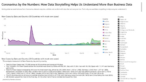
Such studies are extremely useful in going into the depths of how pandemics spread out and their intensity worldwide. The study shown above by Narrative Science could explain how Covid broke out, the intensity of the virus worldwide, the teams and organizations working to find a cure for it, along its impact across the globe.
Moreover, this is just an example; you could also add other features to this. A well-told story can have a significant effect by providing accurate information about the progress made so far.
2. Record And Predict a Future Statistics
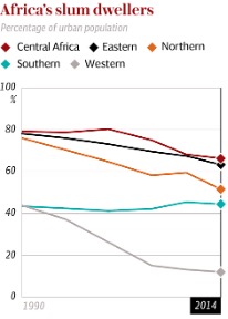
Based on the current situation of a country, you can predict and present what would happen to it in a few years or maybe even a century. Tracking trends allow you to do so. The above picture is taken from a study conducted by Telegraph that shows how the population of Africa will boom and result into four times its current population by the 22nd century.
Such graphics depict trends in an easy-to-understand manner where even non-technical personnel can quickly digest the information. Make sure to check out the article if you’re interested.
-
7 Benefits of Data Visualization

According to a famous saying, “A picture is worth a thousand words“, which means it is easy to describe something pictorially than to elaborate it with words. But a picture
-
Top 15 Types of Data Visualizations Explained

Outline: Types of Data Visualization Introduction What is Data Visualization? What data visualization to use? Best Data Visualizations for each concept: Bar Graph Column Chart Line Graphs Area Chart Scatter
-
10 of the Best Data Visualization Libraries in Python
You might be sick of hearing that information is exploding at a pace that humans cannot even fathom, keeping up with that is out of the question. The best part
Conclusion
Collecting valuable insights and information and interpreting them is also vital. The failure to present your company’s data in the right way may result in losses in the future. Data visualization and storytelling tools help you overcome that by allowing you to layer and connect your information and display it in a way that will help your company flourish.
Both of these tools work hand in hand to help you identify the blind spots of your company and tell you how you can overcome them. Throughout the article, we have covered the topics from the very basics and saw how they have a strong connection with the human mind, making them effective communication tools.
