Outline:
- Types of Data Visualization Introduction
- What is Data Visualization?
- What data visualization to use?
- Best Data Visualizations for each concept:
- Bar Graph
- Column Chart
- Line Graphs
- Area Chart
- Scatter plot
- Pie graph
- Bubble graph
- Waterfall graph
- Mekko graph
- Bullet graph
- Box and whiskers plot
- Funnel plot
- Gantt chart
- Violin plot
- Tools and libraries for visualization
- Python Visualization libraries
- D3 JS
- Canvas JS
- Google Charts
- Data Visualization Softwares
- PowerBI
- BIRT
- Tableau
- Ending Note
______________________________________________________________________________
“The greatest value of a picture is when it forces us to notice what we never expected to see.”
– John W.tukey
When it comes to understanding, interpreting, or analyzing a large amount of data, data visualizations play a vital role. Data Visualization makes your data speak and makes it much easier to recognize any hidden information and trends in it. So, whether you are looking for a comparison of data, showing patterns, showing changes or relationships and connections in the data, Data Visualization is the Answer!
What is Data Visualization?
The representation of data with visuals such as graphs, flowcharts, plots, etc., is referred to as Data Visualization. Data Visualization is very useful for representing various kinds of Data; Nominal, Ordinal, Discrete, or Continuous.
A good data scientist knows how to represent different kinds of data and what visualizations to use to convey information properly. Descriptive and aesthetics visualizations can capture the viewers’ attention and provide a whole new meaning to the data.
“Visualizations act as a campfire around which we gather to tell stories.”
With all the hype about data visualizations and their advantages, it often gets intimidating to understand what kind of visualization to use for each concept? Well, you do not have to worry; in this article, we will discuss a lot of types of visualizations and discuss the suitable plots/graphs for the kind of data or information you are looking to extract.
So, stay till the end of this article, and you will know exactly which tools and plots to use for your data!
What Data Visualization to use?
There are many data visualization techniques you could employ to get insightful visualizations; it boils down to the specific use-case or purpose. A histogram is suitable for the summary of Discrete and Continuous data, and Scatter plots are practical tools to see the spread and relation of numeric data, for instance.
It is the job of a good Data Scientist to know exactly where to use a particular visualization to convey the Data’s findings. We will discuss the commonly used visualizations in detail below. Moreover, we will also look at some useful tools that could make your job very easy. These tools are user-friendly and help to create quite aesthetic and informative visualizations in merely a few steps.
Highly Recommended Article:
5 Factors to Consider When Selecting the Right Data Visualization Tool
Top 15 Types of Data Visualizations Explained
Bar Graphs
One of the most common types of graphs in Data Visualization is the Bar graph. Chances are that you have seen them in everyday life, in news, reports, research, and stats. So, as we promised, in this article we will explain the use of every kind of plot. The bar graph is used mostly for categorical data. With the help of bar charts, we can very easily compare each category. The bar graph contains bars/containers along the x-axis, i-e. horizontally from left to right.
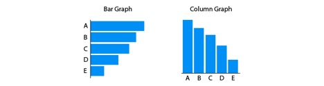
Column graph
The second most common graph on our list is the Column graph. The column graph is very similar to the bar graph. Some people refer to a column graph as a vertical bar graph. They are the same as the Bar graphs except the containers/ bars are vertical. Column graphs are also commonly seen in our everyday life. Both bar graphs and column graphs are used to show the same kind of Data. These graphs answer the question of “How Many?” from a dataset.
An example would be to show the marks of students in a class out of a hundred, in buckets of 20. Through a Bar and Column graph, we can easily visualize in which class most of the student grades fall? This can be useful for various reasons for the teacher.
Line Graph
The most commonly used data visualization for continuous Data is the Line graph. A line graph represents the continuous data with the help of a solid line. Line graphs are very useful for showing time-series data, as they clearly show the trend of data with respect to time. The line graph’s direction shows the trends; if the line goes upwards, it means that the value used to represent the graph is increasing with time. Similarly, if the line dips downwards, it shows that the value is decreasing with time.
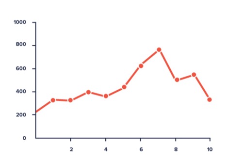
A very useful example of using line plots is for showing the Number of Covid-19 cases with time. Line plots are also very widely used to indicate currency values, such as the Dollar rate, or for constantly monitoring the values of Cryptocurrencies like Bitcoin, etc.
Area Chart
An area chart is similar to the line chart, but in the area Chart, the area below the line is highlighted to emphasize the effect. Area Charts are most commonly used to show multiple parameters on one graph, also called the Stacked Area Chart. The highlighted area is kept a little transparent to show the overlapping between the different parameters.
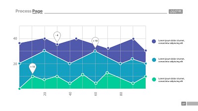
So, the question here is; when to use an Area chart and when to use a Line chart?
As we mentioned, line charts are helpful for visualizing one dataset’s change, usually time series. The area graph is useful for showing the change between multiple datasets to better understand and compare the two. In essence, line graphs are used to show values, whereas the Area graph highlights the trend.
Scatter Plot
Scatter plots are very useful for showing large datasets. Also referred to as scattergram, scatter chart and scatter diagram, the plot shows a point in multidimensional plains. The dimension of the plot depends upon the number of variables in the plot. Scatter plots provide rich visualizations when it comes to large datasets.
You can also use different colors for a different type of data, better showing the overall relationship between the data such as the spread of data, the outliers, the mean and the areas of interest, etc.
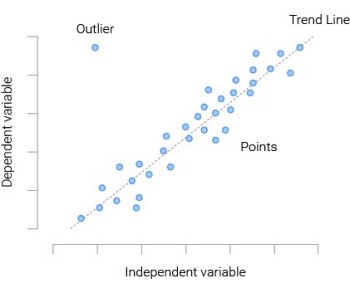
As obvious as it is, scatters plots are used to visualize numeric data points. Here’s a scatter plot example: is to plot points on the graph with a width on the x-axis and the height of the y-axis. By looking at the scatter plot, we can find the trends of the objects in the dataset.
A scatter plot showing values increasing from the bottom left to the top right shows a positive correlation. And a scatter plot showing opposite trends is called the negative scatter plot.
.
Pie Chart
A pie chart is a circular graph showing the percentages of each type of data. This Data visualization technique is ideal for showing the weights of different data classes present in a dataset. The class with the most occurrences would have the greatest Pie slice. The advantage of using pie charts is that the Data is shown relatively. A full circle shows 100% of the data, and each pie slice shows the percentage of that specific class.
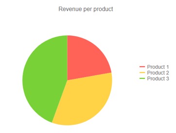
Pie charts are frequently used to show the responses of the audience. Survey reports make use of pie charts to demonstrate the data collected. It is a simple and effective data visualization technique to give meaning to your data!
Bubble Chart
Bubble charts are most commonly used to display data of three dimensions. It is similar to the scatter plot that we have discussed previously.
The difference between a scatter plot and a bubble chart is that the latter uses bubbles of various sizes instead of the former’s data points.
The bubble chart is used to display the relation in complex scenarios such as Medical, social, industrial, and economic data. The size of the bubble depends upon the value in the dataset.
Waterfall chart
A waterfall chart is also used for the comparison of data. The graph consists of blocks; the size of the block depends upon the initial value and the change in that value. If the change is positive and significant, the block will have more area towards the top of the graph, the color shows that the intermediate values are increasing or decreasing. On the other hand, the block area is less if the intermediate values are not very far from the initial values.
A waterfall graph is very useful in seeing progress over a period. Say each block in the waterfall diagram shows a month and the values on the y-axis are for the balance in a bank account, the graph is very useful to compare the results of each month as well as get an overall idea of the bank account.
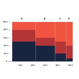
Mekko Chart
The Mekko chart is somewhat similar to a bar chart in the sense that a bar chart shows the data in one dimension, whereas the Mekko chart displays data in both dimensions. Also known as the Marimekko chart, it is a stacked chart with varying column widths. The width of the segment depends on the relative category of the data. The total width is equal to 100%, so the segments’ width shows the values in each category.
So, the chart is very useful for comparing different categories and the distribution of data in each segment.
Bullet Graph
Want to track your work progress? The bullet graph is for you!
The bullet graph a variation of the bar graph. The bullet graph shows the progress towards a goal; It compares the progress to the other measure and provides feedback in the form of a rating to track performance.
This is known as the feature measure and is what makes Bullet graphs so useful.
The color-coding in bullet graphs is also used to display the progress. Each color is associated with progress; a red color shows bad performance, whereas green color shows positive progress. Stephen Few designed this variation of Bar graph.
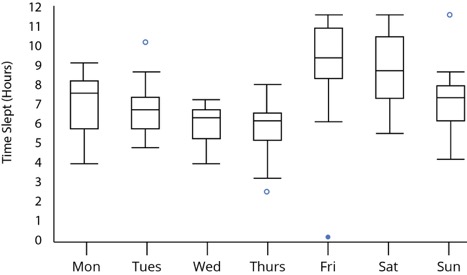
Box and Whisker plot
The box and Whisker plot, commonly known in statistics, is very useful for depicting numerical data groups by quartiles. The name comes from the fact that the graph consists of boxes and lines coming out from both sides of the plot showing variability from the upper and lower quartiles.
The five-number summary of a set of Data is given by the Minimum, first-quartile, median, third quartile, and maximum. Dots show the outliers from these points. The height of the Box, as well as the whiskers, depends upon the spread of data.
Funnel chart
The funnel chart is shaped like a pyramid upside down, hence the name Funnel. The graph shows a series of steps with the completion rate of each step. They are useful in conditions where we need to visualize the flow of things, like a hierarchy of people in organizations. The width is narrow at the top and increases as we move downwards.
Funnel charts are often used to visualize the bias. They are also used for reviews and meta-analysis.
Heat Map
The heatmap is a visualization that shows the relationship between multiple elements. It is similar to a matrix, showing the relationship between each element of one category to each element in the other. The shades of the color show the value in the cell corresponding to the two elements on each axis. Heatmaps are very useful in different applications of data analytics.
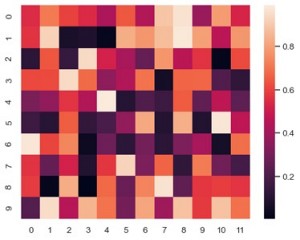
Heatmaps are used to show user behavior on web pages. It keeps a check on what features extract the most attention from the majority of the audience. So, they are very useful for displaying information about very large datasets.
Gantt chart
Gantt charts are often used for management purposes. They are a mixture of bullet charts and bar charts in the sense that they are used to track progress for projects and use horizontal bars to display progress and estimated time. A Gantt chart shows the start and end of each task in a project and the overall time duration of all tasks.
Gantt charts are perfect for estimating how long a project will take, as it splits the entire project into smaller chunks and estimates the time for each chunk.
The time is along the x-axis, and horizontal bars on the graph show each task’s progress. Arrows are also drawn on the graph showing the relation of different tasks with each other.
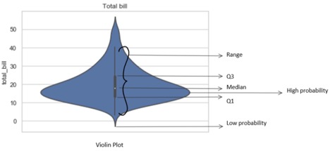
Violin plot
The violin plot is very useful for showing different statistics of numerical data. The plot is similar to the box plot by showing summaries such as median, mean, etc.; additionally, it also shows the overall distribution of data and the probability density. The peak, valleys, and tails of each group can be interpreted to compare the two distributions. It is useful for identifying similar groups as well as the difference in each group.
What Tools and Libraries Are Used for Data Visualization?
There are ample tools and technologies available out there that can be used for data visualization. Some of these tools are very user-friendly and can help create artistic and informative visualizations in just a few simple steps, while others require a sound understanding of the technicalities. It all depends upon your experience and liking.
So, here are our top picks:
Python Visualization Libraries
Python consists of some of the most interactive and practical libraries. You can create stunning visuals with just a few lines of code. The library takes care of all the nitty-gritty details. Python libraries are used to design a variety of graphs and plots such as Bar Charts, Pie Charts, Histograms, Scatter plots, and line graphs, just to name a few common visualizations.
So, if you are familiar with Python or any other programming language, just try your visualizations with some of the few libraries mentioned below and you would be surprised by the ease and outcome:
D3 JS:
D3 JS, as the name infers, is a JavaScript library for Data-Driven Documents and is used to create highly interactive visualizations in the web browser!
This library is for you if you are familiar with Web programming, HTML, CSS, JavaScript. It follows the same DOM Nodes and is very similar to jQuery. D3 JS only works with the data following data input formats, although you can extend that by writing custom JS Code:
- CSV
- JSON
- Geo JSON
Canvas JS:
Canvas JS, like the D3 JS, is also a JavaScript library. It is simple, free, and open-source but highly flexible when it comes to creating charts; it allows interaction along with animations! The output can be shown in Web browsers as well as mobile browsers. So, if you are looking to implement simple but aesthetically pleasing graphs and charts for Web and Mobile, Chart JS is for you!
Google Charts:
Google Charts is a powerful, purely JavaScript-based visualization tool designed specifically for Web browsers. The tool provides a wide variety of graphs and plots, which are highly interactive and dynamic. The main highlight of Google charts is that they can work with a wide range of Input Sources, including SQL Databases, Google Spreadsheets, Salesforce, and Google Fusion Tables. Google Charts are very popular amongst developers as they provide quality outcomes and are free to use.
-
The Role of Data Analytics at The Senior Management Level

From small and medium-sized businesses to Fortune 500 conglomerates, the success of a modern business is now increasingly tied to how the company implements its data infrastructure and data-based decision-making. According
-
The Decision-Making Model Explained (In Plain Terms)

Any form of the systematic decision-making process is better enhanced with data. But making sense of big data or even small data analysis when venturing into a decision-making process might
-
13 Reasons Why Data Is Important in Decision Making

Data is important in decision making process, and that is the new golden rule in the business world. Businesses are always trying to find the balance of cutting costs while
Make Good Visualizations with no Coding Skills
Now that you know all about the different kinds of visualization and know in which cases you should use each of the 15 types of visualizations. You must be wondering if there are any tools with a good GUI (Graphical User Interface) that do not require coding to make aesthetically pleasing visualization for your large datasets.
Here are three of the most used data visualization tools that can be used with no coding skills:
Tableau:
Tableau is a leading data visualization tool being used in the industry. It is because of its flawless user experience and easy-to-use features that make it so popular. Tableau is a very powerful tool capable of designing highly interactive and alethically pleasing dashboards from your raw data.
Tableau is a go-to tool for Business Analysts across the globe for a reason; it has an extensive collection of visualization and options available at your fingertips. Tableau can be used Desktop, on a server, or can be hosted. It has multiple import and export options. With all that, Tableau also has a public version that is free to use!
PowerBI:
Released in 2014, PowerBI is inarguably the most widely used data visualization software in the Industry. The software is developed by Microsoft and is the most favorite tool for many business analysts. The interface is based on Microsoft Excel and even a new user can easily create their dashboards and reports.
Once the dashboards are created and you have the insights, you can easily embed the visually pleasing dashboards to your website or project. You can use the Mobile app to incorporate changes in the go! The tool can take your raw data and convert it directly into useful insights for smarter decisions.
BIRT:
BIRT stands for Business Intelligence and Reporting Tool. As the name suggests, this open-source tool can create stunning visuals and reports that are easily embedded into websites and rich clients. BIRT is based on Java language and Java EE. It has two main components; the Eclipse IDE for creating reports and a runtime component for generating the reports that can easily be deployed to any Java environment!
Ending Notes
With the rapid increase in data and the dire need to make sense of it, data visualization is more important now than ever! This article makes sure that you don’t get left behind in this race of data. If you are still confused about any of the data visualizations, go through the article again or look for more information provided in the links throughout the article.
Knowing the different techniques and data visualization is essential for everyone. With this article, you come one step closer to converting your raw data into aesthetically pleasing flowcharts and dashboards!
