Data visualization is a skill one can polish with practice and practice only. However, as a newbie, it’s pretty daunting to decide how to start practicing data visualization once you’re done with the theory and stuff. But worry not! Because in this article, we will guide you through the concrete steps you can take to make your own data visualization projects. We will also be going through some compelling examples of data visualization projects to help you get off the ground!
So, whether you’re looking for some fresh and practical ideas for data visualization projects, or you’re just a beginner who doesn’t know what to visualize, you’re in the right place. Let’s get started without any further ado!
What is Data Visualization?
Before we move on to the bigger topics, we must first understand what data visualization is. Data visualization is the graphical representation of your data in the form of charts and graphs etc. You can visualize your data to support, and best represent your results. Data visualization tools like FusionCharts, Datawrapper, and Infogram allow you to visualize your data according to your needs.
Today there are multiple ways in which you can represent your data. Some of these are the classic methods of displaying information, and the others are new and modern ways that have been derived from the old ones. We’ll discuss all these methods later in this article.
How Do I Start a Data Visualization Project?
Seeing how important data visualization is, you must be wondering how you can visualize your data yourself. Here we will be breaking down the steps of doing a data visualization project.
A data visualization project can be broken down into the following steps:
1. Find The Purpose Behind Your Project
2. Collect The Required Data
3. Refine Your Data
4. Choose How You Would Like to Visualize Your Data
5. Visualize!
Let’s explore these steps in a more detailed manner down below:
1. Find The Purpose Behind Your Visualization Project:
The most crucial step of this entire process happens to be a clear understanding of the purpose of your research and the topics of your research. You can only evaluate the final results if you know your research’s basis. You can only tell if the results are your desired results when you know what you are looking for.
2. Collect The Required Data:
What type of data will you be working with, and where can you find it? You need to collect all the data you need to conduct your research, and the data you are collecting should be relevant to the purpose of your research. There are, of course, many resources available from where you can collect your data. The resources could be internal or external as well. It is better to include all possible datasets for better and more accurate results.
3. Refine Your Data:
Not everything you collect could be fit for your research. You need to set a criterion for the data you have collected in order to get rid of all the redundant data. It is essential to refine your data because any extra information that you give will alter your results. Therefore, to save your time, money, and effort, you must rid your data of all unnecessary data beforehand. To set appropriate parameters, it is essential to remember what you are researching and the results you’re expecting.
Here are some different ways to clean your data:
1. Removing all extra variables
2. Correcting any obvious errors
3. Make sure that all units are standardized
4. There are no blank spaces, i.e., missing information
Along with all of this, you also need to give your data a logical order and arrange it in an appropriate sequence so it is easy for you to visualize it in the end. To do so, you can divide your data into proper groups or rows and columns, which display the relations between all present variables.
4. Choose How You Would Like to Visualize Your Data:
If you are familiar with the type of data you are working with, this step will become relatively easy. You need to have a clear idea of how different dependent variables in your data set are on each other to determine the type of visualization best suited for your data.
Some questions you can ask yourself are:
- How is one variable related to the other?
- What sort of relationship is there between two different variables?
- What kind of trend is being followed by the data?
- Can you divide the dataset into smaller parts?
Later in this article, we will talk about the several types of charts and tables available. However, if you are still facing ambiguity while choosing the correct chart for your data, many sites offer assistance in this matter.
5. Visualize:
Now that you have everything else sorted out, all you have to do is create your visualization. There are many different tools and software available online (some of which have been mentioned above as well) that allow you to create your visualizations. Once you are done designing your charts, you can evaluate them and make changes till it meets your requirements.
Top 10 Data Visualization Projects to Get You Started
Let’s move on to some beautiful visualizations that can serve as inspirations for aspiring newbies and can be tackled as projects. I’ll leave a link along with every visualization so you can go check it out in detail if you’re interested. Also, keep in mind, that you don’t have to strictly follow these visualizations, and can add a personal touch here or there as well, which is the whole point of data visualization.
Some of these visualizations are interactive, that comes under the hood of advanced analytics. But as a fresher, you don’t have to worry about that right now. Just notice how different visualizations to aid different use cases. Let’s see:
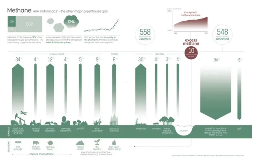
As an environmentalist, you could take inspiration from the beautiful visualization above (it shows where the methane gas comes from and how we can reduce its production). Similarly, you can make a visualization of any environmental issue. There is plenty of information available online, and taking help from that, you can easily make your own visualization.
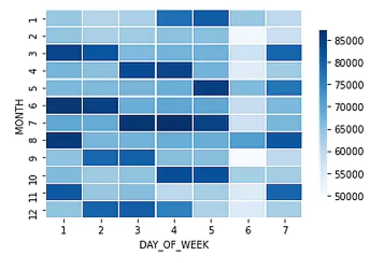
If you happen to be a “shopaholic”, you might be interested in the heatmap above because it shows how much people shop around the year. Similarly, you can also make a heat map of the sort that could present any situation in which you need to check the frequency of an event.
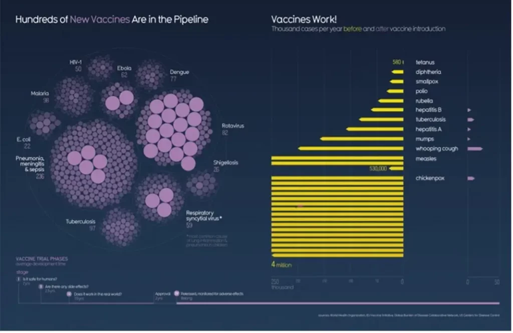
Considering the recent Covid-19 situation and how everyone hesitated before getting vaccinated, visualizations like the one in the picture above push people toward making the right decision. The visualization above is a collection of the information regarding vaccines for different viruses and how effective those vaccines proved to be. Visualizations like these prove to be highly beneficial for the medical sector.
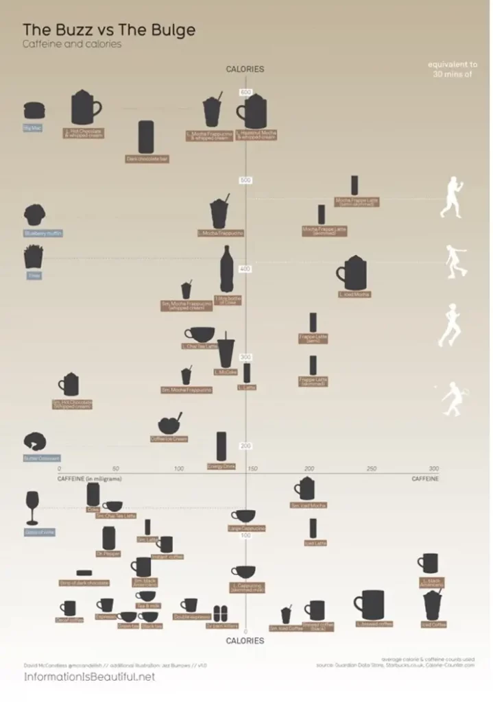
This one is for all the “foodies” out there. The visualization above compares the calories present in a caffeinated beverage vs. the calories in a regular food item. You, too, can make a data visualization project similar to the one above and compare different types of food items. Or better yet, create a visualization that separates healthier food items from the unhealthier ones, or you could even make a visualization that will show the number of nutrients present if different types of meals.
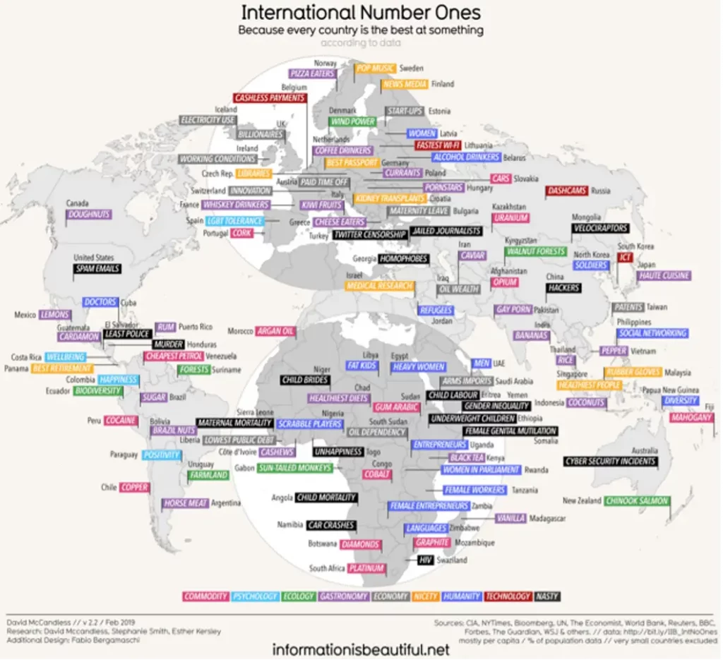
Not every visualization has to be thought out or about something serious; it could also be about something completely random. For instance, the visualization above shows what each country is the best at. This once seems to be based on stereotypes and popular opinions about each country. Just like this, you can also create a visualization of something silly just to pass the time and practice the skill.
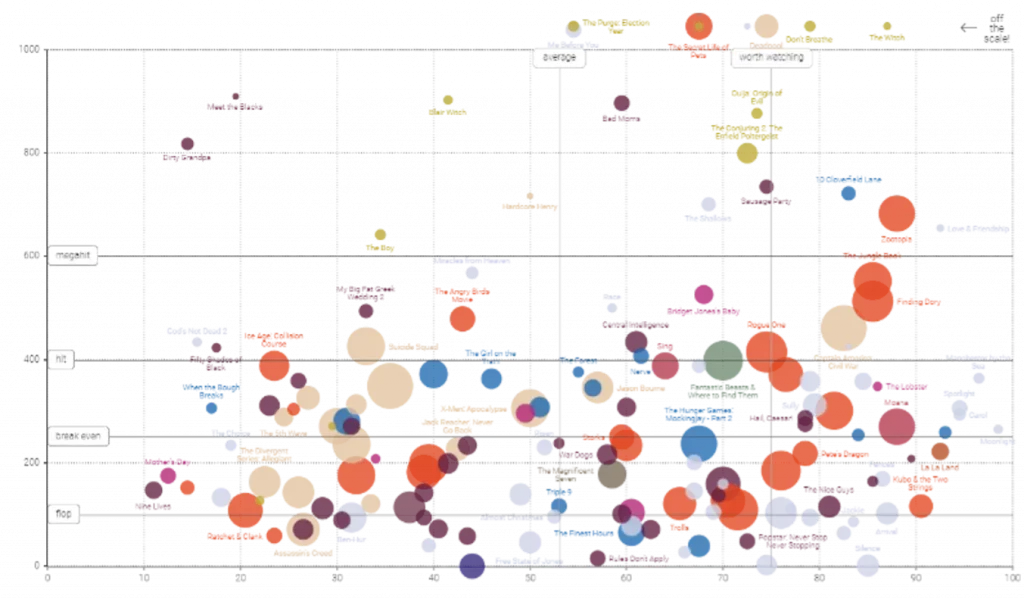
When you think of a scatterplot, many probably think of the average scatterplot they were forced to make in math class, but who would have thought that a scatterplot could be styled into something like this. The scatterplot in the visualization above shows how much money some of the most popular movies made by the year 2016. Could you have guessed that something so dull as a scatterplot could be molded into something this interesting? The art of data visualization allows you to turn boring old charts into something glamorous.
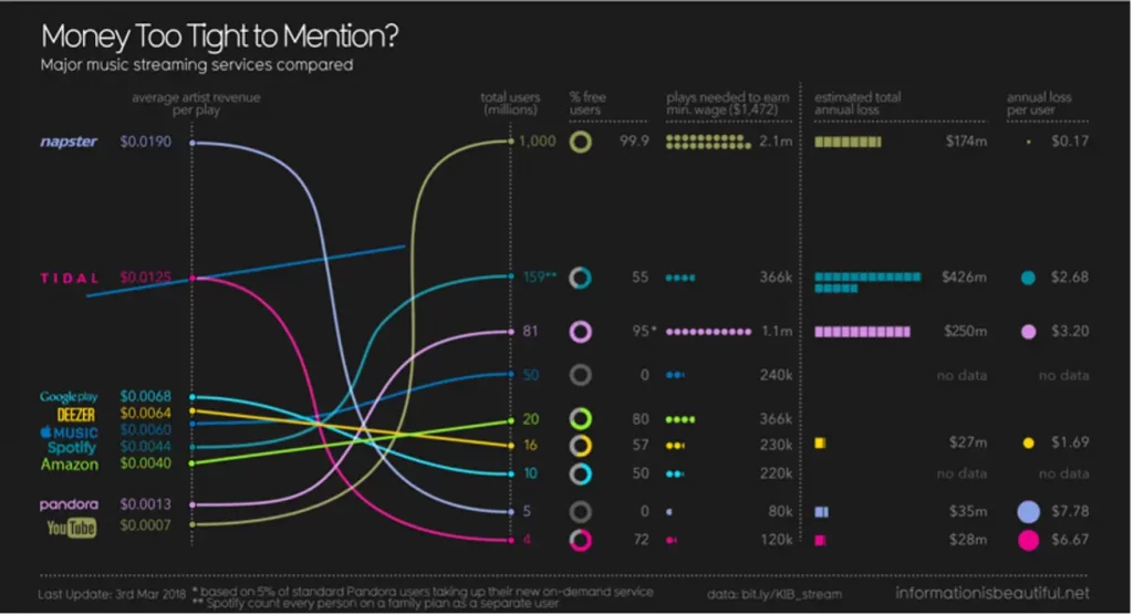
Ever wonder how other people benefit from your use of different social media platforms and mobile apps? Well, someone did think about it and made a complete visualization of it! This visualization shows how much money goes to an artist when one person views that particular artist’s song or video.
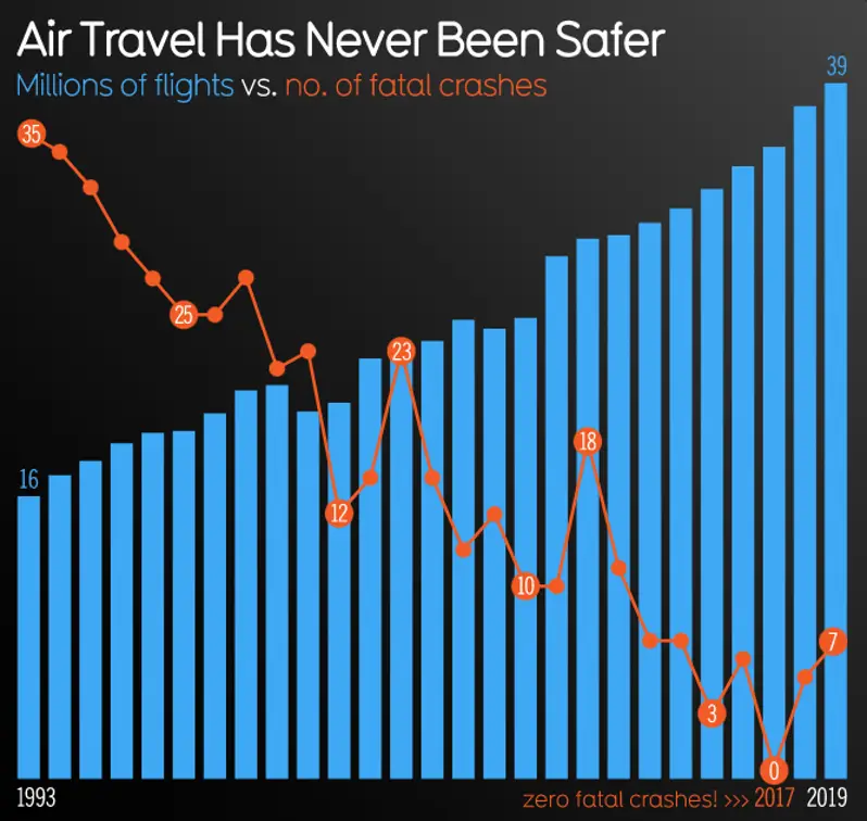
Data visualization has multiple purposes. This one, in particular, compares the statistics of the number of planes that have crashed and the number of flights that reached destinations as planned. The marketing sectors of every company mostly use such visualizations to attract more customers. If you happen to be a businessperson, you could make a data visualization like this to increase the popularity of your company’s popularity and increase your company’s interaction with its customers.
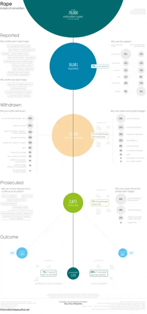
If you want to spread awareness on an issue, just make a visualization of it! Gather all the relevant and credible information available on that issue and visualize it. That way, anyone interested in knowing has all the information they need in one place. The creator of this visualization has collected information about rape cases in the UK for over a year, along with the number of actually convicted people. Visualizations like these can be used to raise awareness of serious causes.
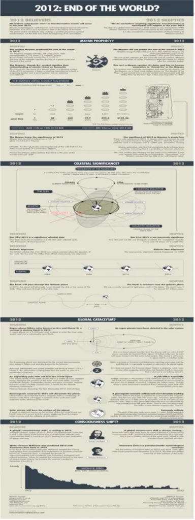
You can take advantage of data visualization, test different theories, or talk about your cultural beliefs. The visualization above lays out reasons to prove the theory of how the world should have ended in the year 2012.
You may be wondering why many of these options are almost similar to one another; so, what is the point of having so many different types of charts? The relationship between your data could be linear/non-linear, have one or multiple dimensions, be arranged in a hierarchy, or simply be connected in a network. To cater to all these different situations, there are many options present in which you can visualize your data.
What Makes Data Visualization So Important?
Data visualization happens to be a vital field of Data Science. Many companies are now seeking out people with data visualizing skills because of the rising importance of data visualization. This shows that learning this skill would open many doors for a rewarding career.
A nicely visualized set of data allows you to quickly identify what is essential in your information set and that too in a brief period. If the results are not up to your expectations, you can always make changes immediately because good visualization makes it a lot easier to identify the problems in the system. All the insights you get from the visualizations can then be used to make critical business decisions in the future.
Conclusion
By now, you have probably realized that you can make a data visualization project on basically anything. You just need to recognize the type of audience you are trying to target to understand how you should structure your data or how to set the theme of your project.
You need to understand how important it has become to learn the art of data visualization because of the growth in big data. Data visualization brings many benefits with it, and in order for us to take advantage of all those benefits, we need to understand what data visualization is and how it is done. By the time you reach this part of the article, you have become familiar with all of this, but if you want to learn more about data visualizations and some exciting projects you can do to get you started, click here.
